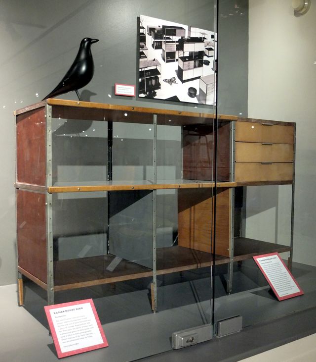

The placard in front of it didn't really say anything specific about this ESU. It was just a brief description of what an Eames Storage Unit is.
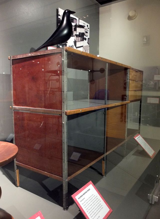
The construction doesn't look like a typical ESU. For one, the feet are Domes of Silence and not the little black or gray rubber ones.

The plywood looks a little thick as well.

The panels are also wood, not Masonite.

Check out this wood brace to prevent the legs from bending. It's like a mini-splint.
Due to a tendency to bend, this leg design was actually changed to inset tubes in 1952.
Anyway, I think this is one of the, if not the very first, ESUs from 1949.

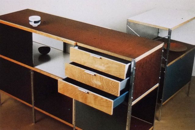
This photo is from the 1949, An Exhibition for Modern Living. It looks like the same one to me.
It's the same configuration, the top and side panels are the same and that white interior shelf is pretty unique.
Image: Eames Design

An Exhibition for Modern Living was curated by Alexander Girard and was held at the Detroit Institute of Arts in 1949.
It was a really big deal. Saul Steinberg did the catalog illustrations.

This was the coming out party for many designs, including the ESU. They didn't go into production until 1950.
The light fixture was by Eames Office employee Don Albinson.
Image: An Exhibition for Modern Living

Here's another angle of the Eames room.
Source: An Exhibition for Modern Living

Ray's plan for the exhibition. Pretty amazing and way better than real life. She was definitely the painter in that operation.
Source: Eames Design

The official launch of the ESU. They were also in Good Design
Source: Arts & Architecture, April 1950

Source: Arts & Architecture, April 1950